One colour that has been trending last year and possibly this year as well is BLUSH . We see it in interiors, fashion, food even. Something so soothing about this colour and seems to appease us all. But, we have noticed a new trend towards the ostentatious, this year. Its become less of a “girly” colour and more stylish. Professional and amateur designers alike seem to be favouring this shade—the more pink, the better. If you ask me I like the dirty, gritty version of the shade, somewhere inbetween a pastel and terracotta. Its earthy, facetted, textural and all the other words designer love to hear about a space.
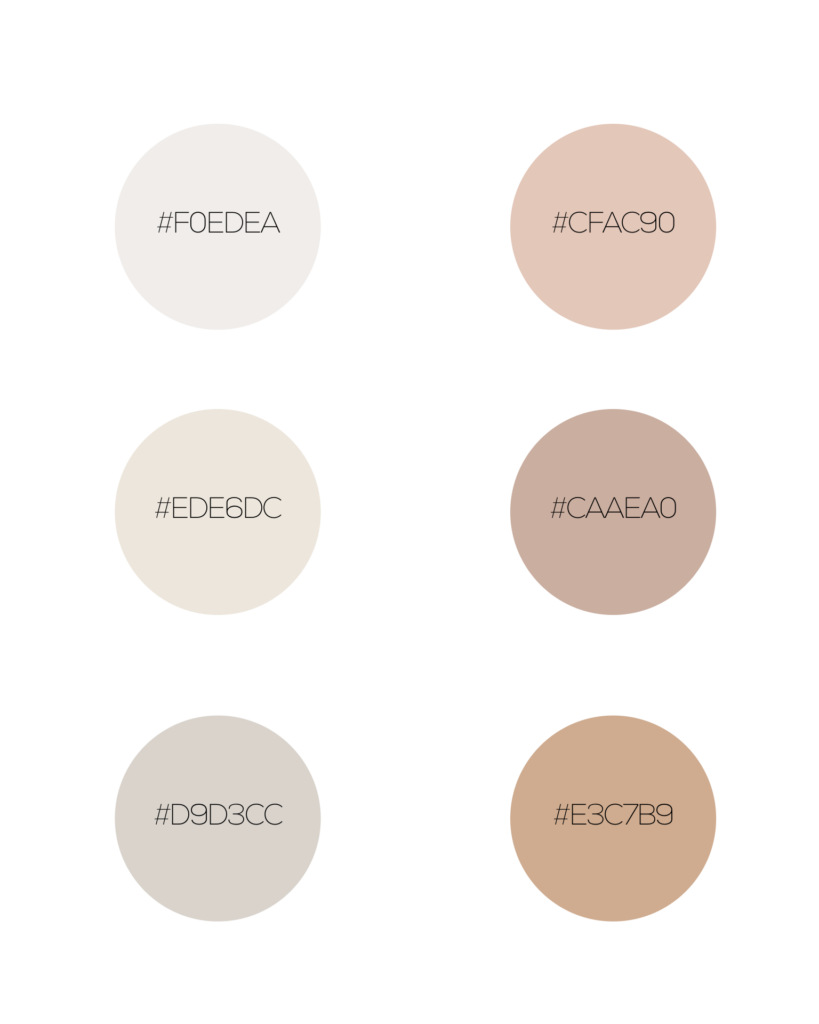
Here are some of my top 6 shades of blush which lean more towards the neutral colour palette, with their hexadecimal colour codes.